In this tutorial, you’ll learn how to build elements using Polymer 1.0. You’ll create a simple Polymer element, a toggle button. The finished button will look something like this:

You’ll be able to use it with simple markup like this:
<icon-toggle></icon-toggle>
This project introduces you to most of the key concepts in working with Polymer.
Don’t worry if you don’t understand everything. Each of the concepts presented here is described in detail in the Polymer documentation.
Step 1: Get set up
To follow this tutorial, you’ll need:
- The starting code.
- The Polymer CLI to run the demo.
Don’t want to install anything? To run through this tutorial online, follow the instruction in Step 1: No install version.
Download the starting code
-
Click the button to download the starting code as a ZIP file.
Download ZIP -
Expand the archive to create your project folder.
Your project folder should look something like this:
README.md
bower.json
bower_components/
demo/
icon-toggle-finished/
icon-toggle.html
The main file you’ll work with is
icon-toggle.html, which contains the definition for your custom element.
Install Polymer CLI.
Install the Polymer CLI to serve the demo locally.
-
Install an active LTS version of Node.js (4.x or 6.x). The current version (7.x) should work, but is not officially supported.
-
Install git.
-
Install the latest version of Bower.
npm install -g bower -
Install Polymer CLI.
npm install -g polymer-cli
Run the demo
To run the element demo:
-
Run
polymer servefrom the repo directory:polymer serve -
Open
localhost:8080/components/icon-toggle/demo/in your browser.(Note that the path uses
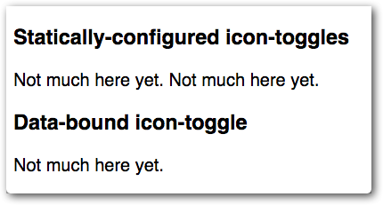
icon-toggle—the component name listed in this element’sbower.jsonfile—rather than the actual directory name. If you’re wondering whypolymer servedoes this, see HTML imports and dependency management.)You’ll see some text where the icon toggles should appear. It doesn’t look very interesting, but it shows that everything is working.

If this text doesn’t appear, make sure you’re looking at the the demo folder itself, or at demo/index.html,
not at toggle-icon.html or toggle-icon-demo.html.
If everything looks good, move on to step 2.
Step 1: No install version
To run through this tutorial online without installing anything:
-
Open the starter project on Plunker.
-
Click Fork to create your own working copy.
Continue to step 2.


